10% OFF
Complimentary engraving available · Free expert gifting advice · Support 9am-9pm IST
PENS
SKU: 80176848 · Out of Stock
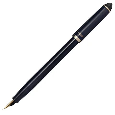
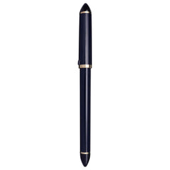
The Sailor Fude de Mannen is a Japanese fountain pen designed for expressive, brush?like writing. “Fude” means brush, “Mannen” refers to “all?man” or “always,” suggesting that this pen aims to let anyone write beautifully as if using a brush. The 12?0150?040 version is the Dark Blue / Navy body with a 40° angled nib.
This model is popular among calligraphy enthusiasts, sketchers, and those who like creative writing with line variation. It offers versatility: thin strokes when you hold it more vertically, thicker strokes when you tilt the nib closer to the paper.
| Spec | Details |
|---|---|
| Model / Reference | 12?0150?040 |
| Nib Angle | 40° (“Fude” angle) — suited for thicker, brush?like strokes when laid down, finer when upright. |
| Nib Material | Stainless steel with gold plating |
| Body Colour / Finish | Dark Blue / Navy; made of AS resin material for this version. |
| Body / Barrel Material | AS resin (Dark Blue model) |
| Filling System | Cartridge & converter compatible (uses Sailor proprietary cartridges; converter sold separately in many cases) |
| Dimensions | Capped length ~?16.9 cm; Uncapped ~?15.0 cm; Posted ~?19.0 cm (when cap is posted) |
| Diameter | Up to ~?15.0 mm (maximum / barrel), grip section somewhat narrower; grip ~?9.9 mm. |
| Weight | Around 12 grams (empty) |
| Packaging | Sold in simple paper packaging; updated packaging from May 2024 in some markets. |
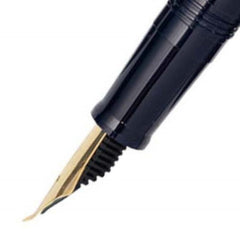
Brush?like writing: The 40° fude nib is bent in a way that when the pen is held at different angles, you get different line widths. More vertical → fine line; more horizontal → broader, brush?like strokes. It allows expressive calligraphic effect without needing a real brush.
Comfort & ergonomic design: The pen is long and somewhat slim (though barrel is thick), light in weight, which helps with extended writing or sketching sessions. The lack of heavy adornments keeps it practical.
Good starter calligraphy tool: Because the fude nib gives a lot of expressive potential with just the tilt of the pen, it’s an accessible way to explore brush?style writing or decorative lettering without getting a full brush or complex setup. It’s often praised for that.
Ink flexibility: Since it uses cartridges and converter, you can use different inks (colours, properties) depending on availability. (Though note: converter might not always be included in the box)
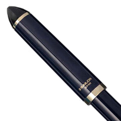
The Dark Blue body is elegant and relatively understated, suitable for both artistic and more formal settings. The finish is glossy resin.
Gold plating on the nib adds a contrasting touch with the blue barrel. Not a luxury precious?metal nib (like gold 14?k or 21?k), but the plating gives a premium look.
Angle matters: To get the full effect of the nib, experiment with different tilt angles. Writing upright yields finer, more controlled lines; laying it flatter gives bold, expressive strokes. But the feed and nib are sensitive; holding too shallow might cause more ink flow or even leaking if not careful.
Ink drying & maintenance: Because of the nib geometry, regular cleaning helps. If ink is left for a long time, performance might degrade (as with many fountain pens). The cap seal is reported to be quite good in general.
Converter: If you want to use bottled ink you need a compatible converter (Sailor’s); in many cases cartridges are included but converter might be extra.
Balance when posted: The cap can be posted (placed on the back while writing) but adds length and may change balance; some users find the cap light so it doesn’t shift weight too badly, but the pen is relatively long when posted.
Pros:
Great variety of line thickness without needing to swap nibs.
Japanese build quality: reliable nibs, decent feed, good fit and finish for its price point.
Attractive design with a refined colour and gold accents.
Lightweight, comfortable for long writing / sketching.
Drawbacks / Things to be aware of:
The learning curve: Getting good line variation requires practice. The nib angle must be managed carefully to avoid smudges or excessive ink flow.
The feed may touch the paper if the pen is very shallow (i.e. when trying to get the broadest strokes) – causing double lines or “splaying.” Some users have modified the feed to avoid this. Reddit
Converter not always included (depending on region), so cost adds up if you want bottled ink.
Cap posting might make it long/unwieldy for some, and balance may shift.
Name / Model: Sailor Fude de Mannen Blue GT
Reference / Item Code: 12?0150?040
Nib Angle / Type: 40° fude (angled nib)
Color / Finish: Dark Blue body (also called “Navy”)
Trim / Accents: “GT” typically means Gold Trim (i.e. gold plated accents) — the nib is gold plated stainless steel.
| Feature | Details |
|---|---|
| Nib Material | Stainless steel, gold plated |
| Body / Barrel Material | AS resin (for the Dark Blue 40° version) |
| Filling System | Cartridge & converter (uses Sailor proprietary cartridges; converter optional / not always included) |
| Dimensions | Diameter (max): ~?15.0 mm; Length (capped): ~?169 mm |
| Weight | ~?12 g (empty) |
| Packaging | Paper packaging (dimensions ~?50 × 225 mm) |
| Barcodes / Alternate Codes | Barcode for Dark Blue 40°: 49?01680?17684?8 |
The angled nib (40°) allows variable line widths: held more upright gives finer lines; laid flatter gives thicker, brush?like strokes. This is the core “fude” (brush) effect.
The Dark Blue version (40°) is recommended for users who tend to write with the pen laid down (flatter strokes).
Because of the nib geometry, there is a known issue among users where, at very shallow angles, the feed’s plastic leading edge might touch the paper, causing double lines or unwanted marks. Some users even modify (file) the feed to mitigate this.
The pen is relatively long, and vendors list the posted length (cap on back) as ~?19.0 cm.
Comes with cartridges (often two) in many markets, with converter compatibility for bottled inks, though the converter is not always included.
Pros:
Great for expressive calligraphy, sketching, line art. People love the flexibility of getting different line widths with one nib.
Lightweight build (12?g) makes it comfortable for long writing sessions.
Elegant design with gold accents on a dark blue body — looks classy without being overly ornate.
Considerations / Drawbacks:
The feed?touch issue (leading edge contacting paper at shallow angles) is a real problem noted by several users.
Balance and handling may shift when posted (cap on back), due to length and weight.
Converter not always included — extra cost / sourcing required for bottled ink use.
The bent nib has a learning curve — you’ll likely need time to master clean strokes and transitions.
On a retailer in India, it is listed at ?1,600.00 for the Fude nib version.
In European shops, the pen is sold under the name “Fude de Mannen Calligraphy Navy / 12?0150?040” with shipping in 1?3 business days.
In U.S./global shops, variants of “Sailor Fude de Mannen Fountain Pen” include the 12?0150?040 model under “Navy Blue / 40°.”
0 Reviews for Sailor Fude de Mannen Blue GT Fountain Pen 12-0150-040