10% OFF
Complimentary engraving available · Free expert gifting advice · Support 9am-9pm IST
BRANDS
SKU: G309PU · In Stock
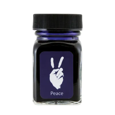
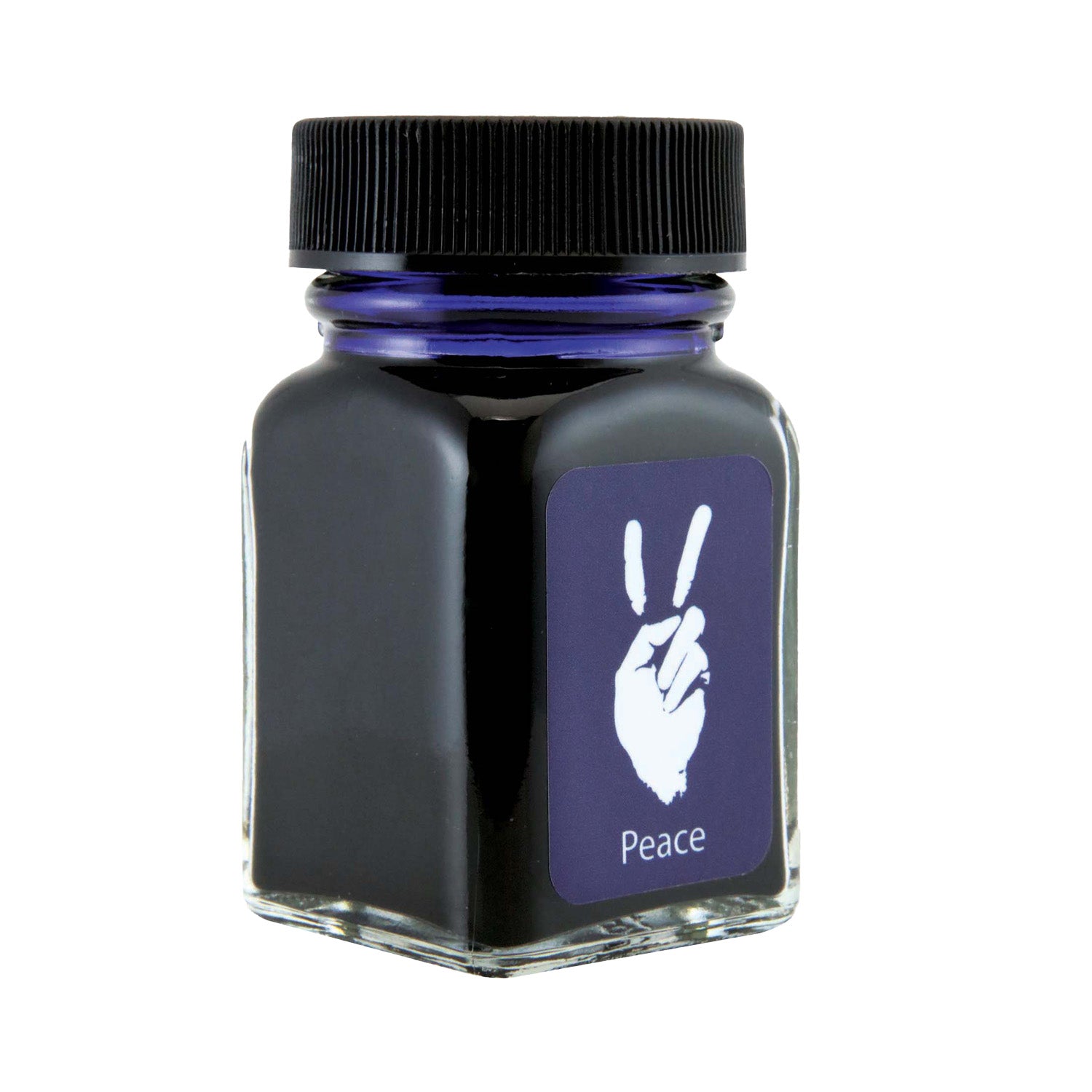
The Peace?Blue variant is part of the “Emotions” collection from Monteverde USA — a themed ink line where each hue is linked to a mood or concept. The Peace Blue shade is meant to evoke calmness, clarity, and a sense of tranquility. According to the official description: “A color that seeks tranquility and understanding above all else, blue is representative of peace and harmony.”
SKU: G309PU.
Volume: 30?ml glass bottle.
Collection: Emotions, alongside other colors (Kindness Pink, Love Red, Gratitude Magenta, etc).
Key feature: Uses Monteverde’s Ink Treatment Formula (ITF) — described as enhancing ink flow, extending cap?off time, and protecting the pen’s feed.
In short: this ink aims to bridge expressive colour and reliable writing performance, with the “Peace Blue” representing a calm, usable blue tone in the Emotions palette.
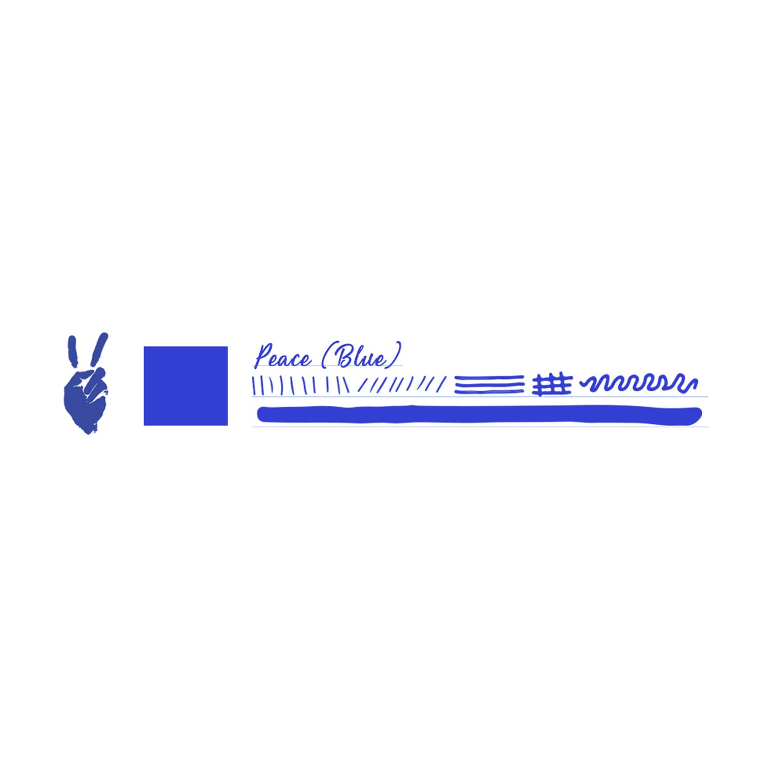
According to reviewers, Peace Blue is “a dark blue that leans a bit purple” — described as somewhere between blue and purple (a “blurple”).
In larger swabs the review noted “a small pop of bronzy sheen”.
On fountain?pen?friendly papers the behaviour is good: one reviewer used Tomoe?River and Rhodia and found no feathering on those, though cheaper paper showed some bleed/feather.
The more formal retailer description emphasises the emotional/psychological aspect: “blue is representative of peace and harmony… watching the clouds move across the sky… you’ll find a higher level of mental clarity and spiritual perspective in your daily life.”
Review from “thINKthursday” found: In a fine nib, drying time ~10 seconds; in a broad nib ~30 seconds on Rhodia paper. “Excellent flow, no feathering or bleedthrough.” blog.andersonpens.com
In “Mountain of Ink” review: Dry time ~30 seconds; water resistance: low; feathering none on good paper; show?through medium; bleed none on good paper. On cheap copy paper there was some bleed/feather.
Summary: Behaviour is good on good paper. It is not a waterproof or archival ink (water resistance is low). It has modest shading and a hint of sheen under favourable conditions.
Bottle is suitable for standard fountain pens (converter/piston fill) as with other Monteverde bottles.
The colour is versatile enough for daily writing (thanks to the “calm blue” tone) but also expressive enough to stand out in journaling or creative use.
Because the Emotions collection has a theme, this ink works well when you want the colour of your writing ink to reflect a mood (in this case peace/clarity).
Not designed (or marketed) for legal/archival use — better for personal notes, journaling, creative writing rather than documents requiring permanence.
Bottle volume: 30?ml (≈1.01?oz) — a practical size for regular use without being huge.
Bottle material: Glass, standard for Monteverde.
Formulation: The Emotions series uses the ITF (Ink Treatment Formula) as a technical highlight — said to “drastically improve ink?flow quality, extend cap?off time, and lubricate and protect the ink feeding systems from corrosion and clogging.”
Price (US): ~US$12 for the 30?ml bottle.
Colour description: Blue representing peace/harmony; specifics: “dark blue that leans a bit purple.”
Distinct But Usable Blue: Peace Blue offers a tone that’s slightly off the standard “true blue” — the purple lean gives it character yet it remains broadly usable.
Emotive Theme: The Emotions collection concept adds a narrative to the ink colour — helpful if you like matching inks to mood, journaling themes or creative expression.
Good Performance Baseline: Reviews suggest solid performance (flow, no feathering on good paper) and respectable dry times in medium/fine nibs.
Value: At the size (30?ml) and price point (~US$12) this provides a lot of ink for expression without being a large commitment.
Shading / Sheen Potential: Although modest, the review notes some bronzy sheen in swabs which adds flair in broader nibs.
Water?Resistance Low: If you need waterproof or archival writing, this ink is not strong in that regard (water resistance was rated “low” in reviews).
Paper and Pen Dependent: As with many inks, behaviour (shading/sheening, dry time, feathering) depends heavily on paper quality and nib size/flow. On cheaper paper, the review showed bleed/feather.
Colour Expectation vs Reality: While described as “blue,” some users may expect more vibrant or different leaning blue — the actual tone is “dark blue with a purple lean,” so if you expect a very bright azure you might be different from reality.
Brand History / Storage Issues: Although not specific to this colour, some community users have flagged past issues with some Monteverde bottled inks (mold, off?smells, etc). Example: > “More than 7 bottles of Monteverde inks have gone bad with very foul smell.” While this may pertain to older batches/conditions, it’s prudent to inspect your bottle.
Moderate Sheen/Shading Only: If you’re seeking dramatic sheen or heavily saturated colour, this ink may offer a more subtle or “refined” effect rather than show?stopping visuals.
Use good paper: To get the best out of Peace?Blue — shading, colour depth, minimal bleed — choose a fountain?pen?friendly paper (smooth surface, moderate absorption).
Choose an appropriate pen/nib: A nib that offers moderate flow (medium or broad) will reveal the full character of the colour (shading/lean toward purple). A very fine or dry nib may render a flatter tone.
Inspect bottle on arrival: Check for any odd smells, sediment, floating film — especially if the bottle has been stored for a while or you’ve acquired it from secondary sources.
Store upright and sealed: To preserve the ink’s quality, keep the bottle upright, tightly capped, away from extreme heat, direct sunlight or contamination.
Rotate use: If you enjoy ink variety, this colour makes a good rotation option; using it occasionally helps keep your pen feed active/flushed rather than leaving it idle.
Not for waterproof tasks: Since the water?resistance is low, avoid using this ink for documents you expect to endure extreme exposure; better for journaling, personal letter writing, creative use.
Brand: Monteverde?USA.
Collection: Emotions collection — a series of inks themed around emotional / colour?mood expression.
Variant Name / SKU: Peace?Blue — SKU?G309PU.
Volume: 30?ml glass bottle.
Colour Description: A “dark blue that leans a bit purple” (described in review) with modest shading and hint of bronze sheen in swabs.
Formulation: Uses Monteverde’s ITF (Ink Treatment Formula) technology – which is said to “drastically improve ink?flow quality, extend cap?off time, and lubricate and protect the ink feeding systems from corrosion and clogging.”
Typical Price (US): US$12.00 (on Monteverde official site) for the 30?ml bottle.
Compatibility: Suitable for all fountain pens (converter/piston/bottled ink systems) as expected for a bottled ink.
Where it fits: A versatile blue suited for everyday use, creative writing, journaling, and those who like coloured inks with personality but still usable.
The Peace?Blue variant gives a uniquely subdued but expressive blue tone (with purple lean) that differentiates it from standard “true blue” inks.
The Emotions collection’s theme adds a narrative dimension — this ink is intended to evoke calmness, clarity, harmony (the “peace” in Peace?Blue).
The 30?ml size is a practical amount — large enough for regular use but compact enough to rotate in an ink collection.
The ITF formulation gives confidence in good flow, decent behaviour and pen?compatibility (assuming normal use).
Review data: On good papers (e.g., Rhodia, Tomoe River) it shows minimal feathering, moderate show?through, and dry time ~30 seconds in one medium nib example.
Swabs show a small pop of bronzy sheen in larger ink patches.
While the ink performs well on fountain?pen?friendly paper, on cheaper or more absorbent paper the review reported some bleed/feathering.
Water?resistance is reported as low in one review. So if you need waterproof or archival performance, this may not be your top choice.
The colour leaning “a bit purple” means if you expected a bright azure or purely vibrant blue, the tone may appear somewhat more muted/dusky. Best to view swabs if possible.
As with all bottled inks, ensure your pen is properly cleaned and the ink system is maintained — especially when using coloured inks and rotating frequently.
While Monteverde’s ITF formulation is positive, some community reviews of Monteverde inks historically mention QC or storage issues (not specific necessarily to Peace?Blue) — wise to inspect bottle on receipt.
Users who want a usable blue ink that has enough character to stand out (rather than plain standard blue).
Writers or journalers who like themed/collections of ink and want a colour that evokes a mood (“peace”, calmness) rather than purely decorative.
Enthusiasts who rotate inks and want a well?behaved colour for everyday letters, notes, or creative usage.
Users with good pen/paper setups (medium or broader nibs, smooth fountain?pen?friendly paper) to maximize the shading/character.
0 Reviews for Monteverede Emotion Ink Bottle, Peace Blue - 30ml